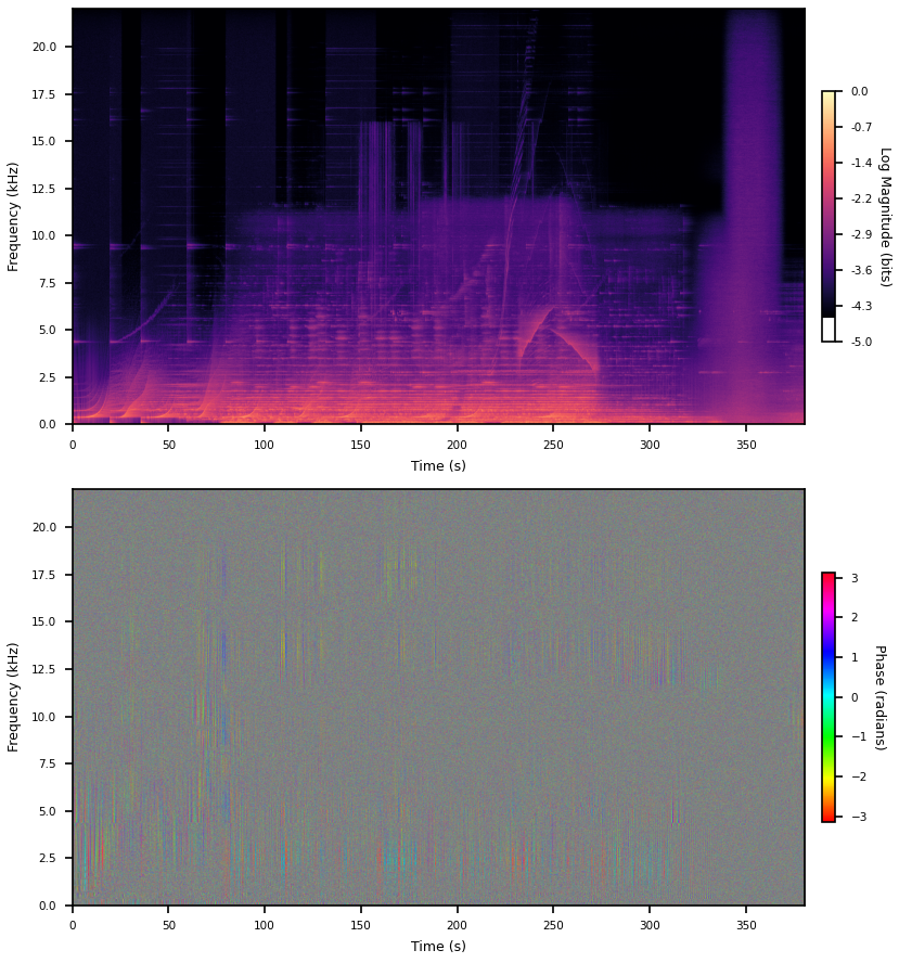
There was a tweet recently pointing out the apparent structurelessness of the phase data that is usually discarded when you compute audio spectrograms. People familiar with audio will know phase is important so this is pretty weird. So here’s quick post about what makes the phases so bad and some tricks to show there is structure to be found in them, but no promises any of it will be useful.
I’m going to use this track for all the plots in this post. It has a bunch of big long chirps and even a big block of pink noise at the end. Don’t ask me. I think you can see someone turning the knob on a filter sweep as well.
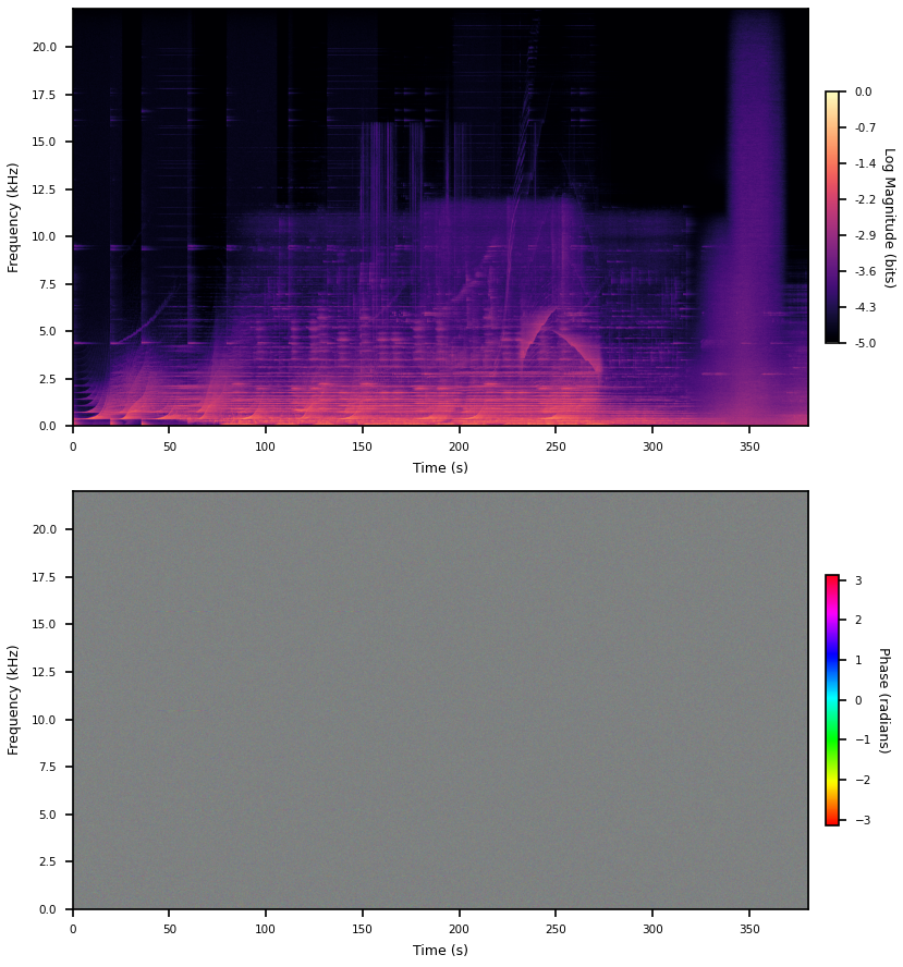
The phases basically just looks like noise. By the way, it’s all grey, even though there is no grey in the color map, because I’m telling matplotlib to do the downsampling in color space. Averaging phases does the wrong thing. Phases are periodic and I’m too lazy to figure out a better way to downsample this data for display. A color off the color map is way less deceiving than a color on the color map, I think.
1
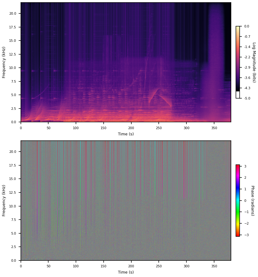
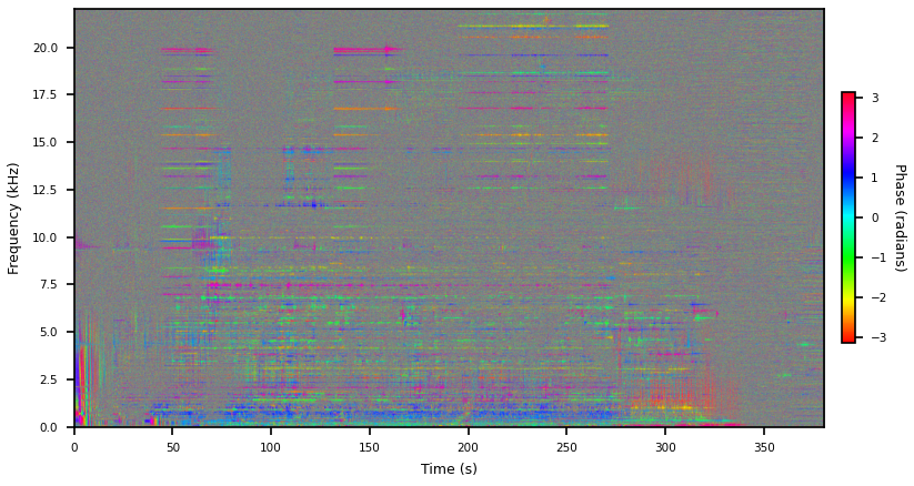
If you don’t window at all (actually a rectangular window) a bunch of structure appears in the phases. But we introduced a discontinuity at the boundaries so there’s loads of bogus high frequencies. Presumably some of this new phase structure is also bogus and just whatever it has to be to place a jump discontinuity between the first and last sample.
Here’s the big brain response to this, which I got from a Miller Puckette paper. This is for Hann (raised cosine) windows. You can observe, empirically, two things. First is that when you take the DFT of a pure tone then the phase of the whole thing jumps by at the bin the tone is in. Second is that when you window this tone the phase now jumps twice, back and forth. So you say okay, if a bin is actually responding to a tone, then probably its adjacent bins have totally opposite phase. So, as complex numbers, they’re pointing in the opposite direction, and you can get a better estimate of the phase by flipping them and averaging. This is just
X = np.fft.rfft(x * window)
X[1:-1] -= X[:-2] + X[2:]
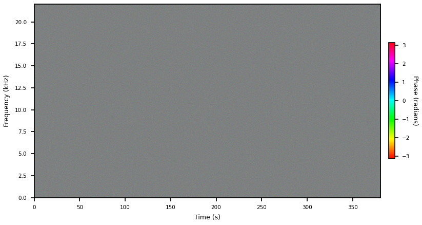
because we don’t care about their magnitudes. In the context of phase vocoders this really works which is kind of fucked up, because if we actually now look at the phases it looks like nothing has changed.
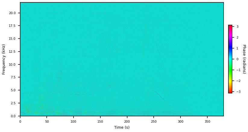
But if we diff these two images we get this. So there’s definitely some legible structure in there.
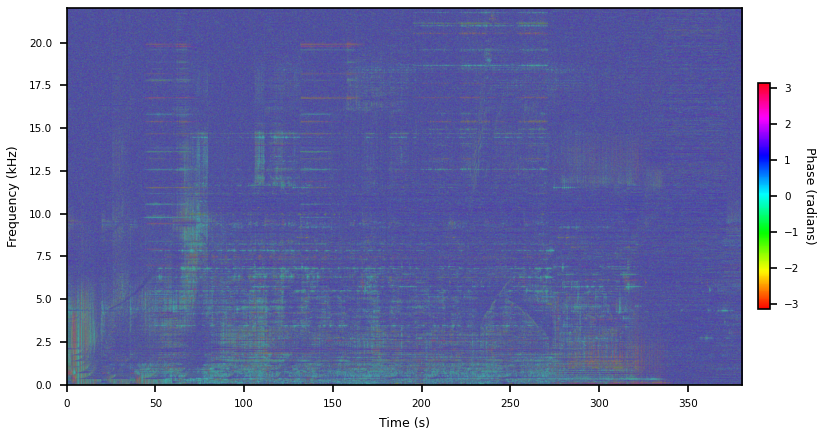
Another thing you can do is just taper the edges of the rectangular window, here I’m just doing 10 cosine samples at either end of a 8192 window. This kills off the high frequencies, which you can see by just eyeballing the spectrogram, but presumably still has all the problems rectangular windows have in terms of sidelobe fall off and whatever else.
It’s removed all those big streaks, so probably they really were bogus. Apparently this is called a Tukey window.
2
Phases are relative. The way to understand this is that if you slide a signal around in time all the phases update (at different rates, even), but audio sounds the same no matter when you hit play.
I’m going to suggest defining phases relative to the phase in same bin in the last window, as phase deltas. I think you should be a little suspicious about this because we do actually care about the vertical phase structure and this will give every bin its own zero phase reference angle, making phases within a single window independent of each other. I don’t think this matters too much as its easy to recover a shared-reference phase in context, and in cases where the phase is not just noise I think the vertical structure is probably pretty stable from step to step. So let’s just do it. I’m using the Tukey window here.
That’s a lot of structure. To get this I unwrapped the phases and computed deltas, both along the time dimension:
# Xs : shape (window, bin)
phases = np.angle(Xs)
phase_deltas = np.diff(np.unwrap(phases, axis=0), prepend=0, axis=0)
The horizontal banding is pretty weird. This happens because higher bins' phases advance faster than lower bins, so their deltas are just bigger. We can get a normalized representation by dividing out the rate at which the sine under that bin advances:
n = len(window)
dt = n // 4 # spectrogram step size
normalized_frequencies = np.linspace(0, 1/2, n//2 + 1)
phase_normalizer = np.angle(np.exp(2j * np.pi * normalized_frequencies * dt))

# ...
normalized_phase_deltas = phase_deltas / phase_normalizer
And that looks like this. Please ignore the incorrect units.
You can see chirps in the phase plot now. This is pretty closely related to instantaneous frequency but I don’t think I’ve ever seen it normalized this way. Someone must have.
End
I’m pretty dubious about this representation being of any use for machine learning. Maybe it would work if you never atan2 out the phase and kept it as a complex number (getting the phase delta is just a complex division). You definitely don’t want to be taking the derivate through anything that wraps the way an Euler angle does.
I had a quick look at recent papers to see what ML people were doing here before yoloing this post out there. It doesn’t seem like anybody is using STFT phases. EnCodec, at least, uses the real and imaginary parts of STFTs at multiple window sizes. That makes sense.